2023

Background
OKX is a crypto trading platform. Auto-Earn, a handy feature that helps users generate passive income on idle funds by automating investments in low-risk products, struggles with a conversion rate as low as 0.5%.
How can we expand our beginner user base by reducing user uncertainty to activate auto-earn as their first purchase at OKX?
Overview
Duration - 1 month
Tools - Data analytics on Amplitude Moderated usability testing User journey mapping Sketching Wire framing Prototyping Platform - iOS Android Desktop
Team - Harsh Pushpkar, Ronak Jain
Core problem
Users with interest in financial products but have made zero purchases are our target users
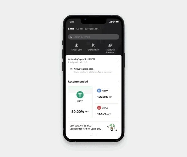
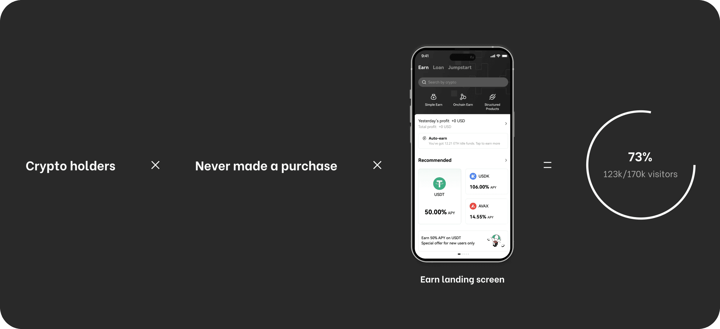
Through conducting user segmentation and funnel analysis, we discovered a fascinating group of crypto newbies who have never made a purchase contributed to 73% of total monthly unique views on the Earn landing screen.The Earn landing screen is an all-in-one portal to accessing OKX financial products. Our hypothesis was this user segment has an interest to purchase financial products from OKX, but just did not know where to start.
Current information design cannot answer users’ questions
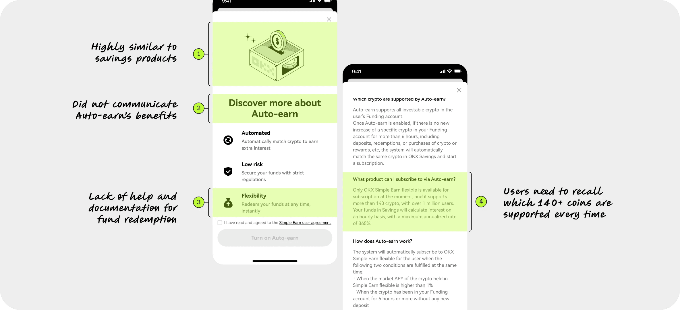
Our team conducted a round of heuristic evaluation in the early design process. We learned that the use of visual does not differentiate Auto-earn from the remaining Earn products’ logic of depositing assets to earn rewards. The title also did not provide extra information about Auto-earn’s benefits.Even though flexibility is highlighted to assure users of their fund liquidity, the lack of guidance on deactivation could be an obstacle for risk-averse users. While Auto-earn supports 140+ digital currencies, it creates cognitive load for users to memorise which crypto currencies they own.
Auto-earn suffers from low discoverability
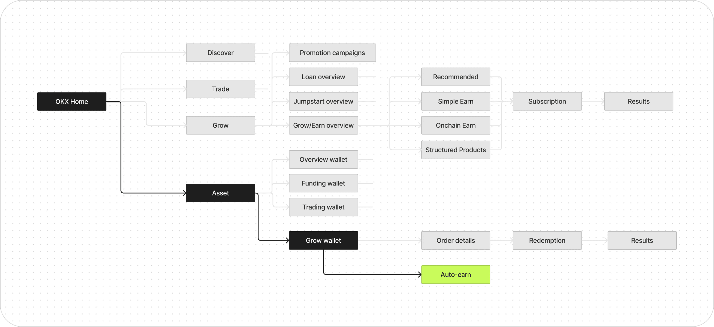
Upon reviewing with 3 OKX users that fall into our targeted user segment, we learnt that the Auto-earn entry point was inaccessible. It was located deep within the Grow wallet, a destination to track performance of purchased products.Hence, for people who have never purchased financial products from OKX before, they would be less intended to visit the Grow Wallet, and therefore the Auto-earn entry point.
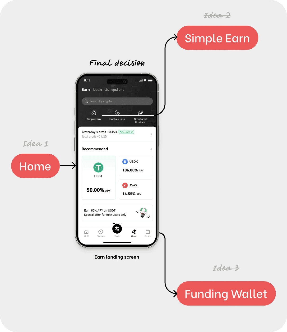
Creating an additional entrance on Earn landing
Supported by the insights found in the user segmentation analysis earlier through Amplitude, the Earn landing screen is evaluated to have the highest visibility to target user group.The home screen's high page views make it a crucial funnel entry point. However, optimizing real estate distribution with other feature promotions across OKX's diverse offerings raises questions and could potentially delay the first iteration.While Simple Earn landing attracts users with a strong intent to purchase financial products due to its straightforward deposition and withdrawal rules, it faces a significant drop-off rate.
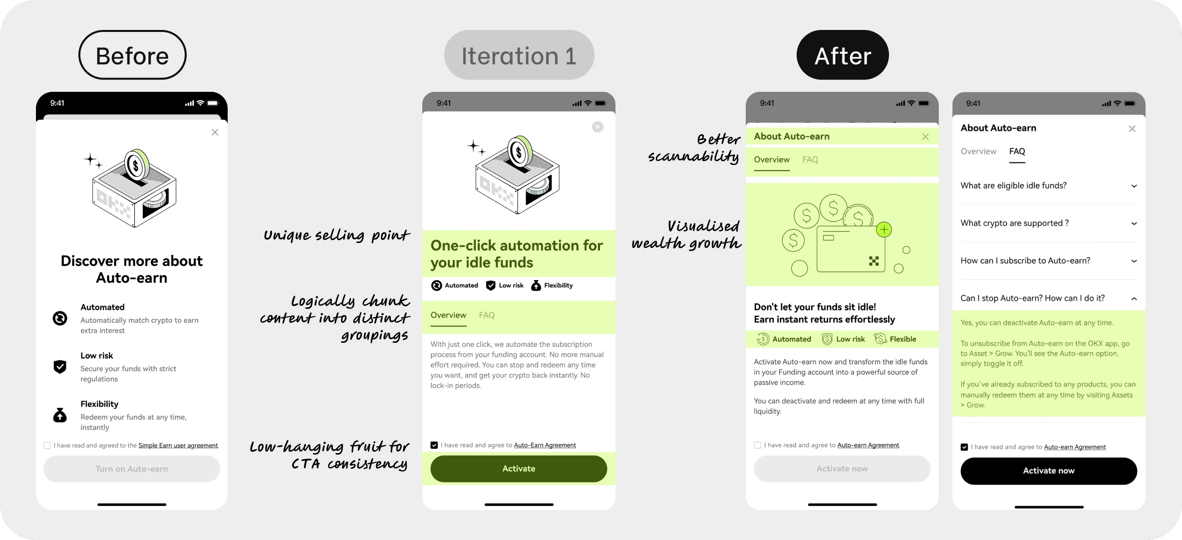
Narrating Auto-earn benefits through content strategy and visual design
Overall, we created a more engaging content to shift from explaining the product logic behind to outlining the benefits and ease of activating Auto-earn. Tab is introduced to segment information into Overview and FAQ for better scanability. We also included the exact step needed to deactivate in hope to build trust with our users.Although one of our early intentions was to showcase major cryptocurrencies supported by Auto-earn in hero visuals, we discovered that the feature is subject to market conditions. Consequently, we cannot guarantee the consistent inclusion of the same set of cryptocurrencies over time. It would be misleading to portray popular currencies in the visuals.
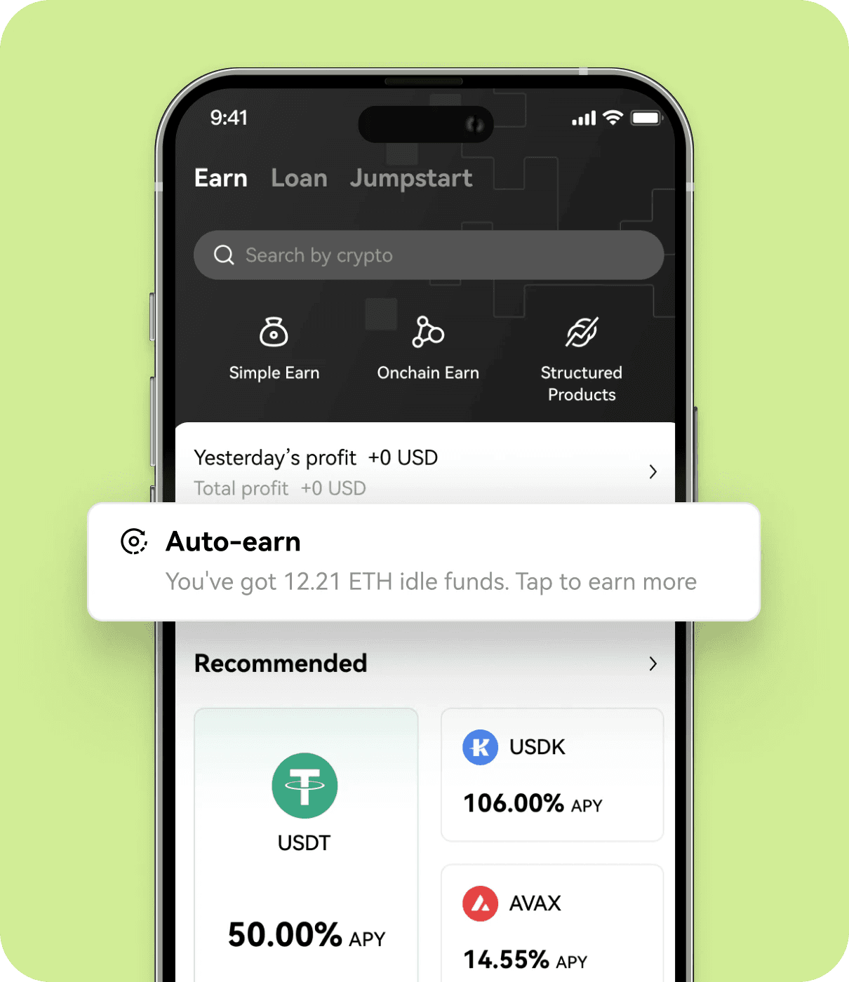
Conveying urgency
displaying the amount of idle funds in users' digital wallets. Leveraging this dynamic content, we aimed to create a more relevant experience and instill a sense of urgency for users to capitalize on the opportunity and earn more.

Elevating Auto-earn from a function to a feature
Throughout the design exploration, we decided to replace the toggle component with a status tag. This change preserves status indication, removes touch area ambiguity, and positions Auto-earn not as a utility but a desired feature.
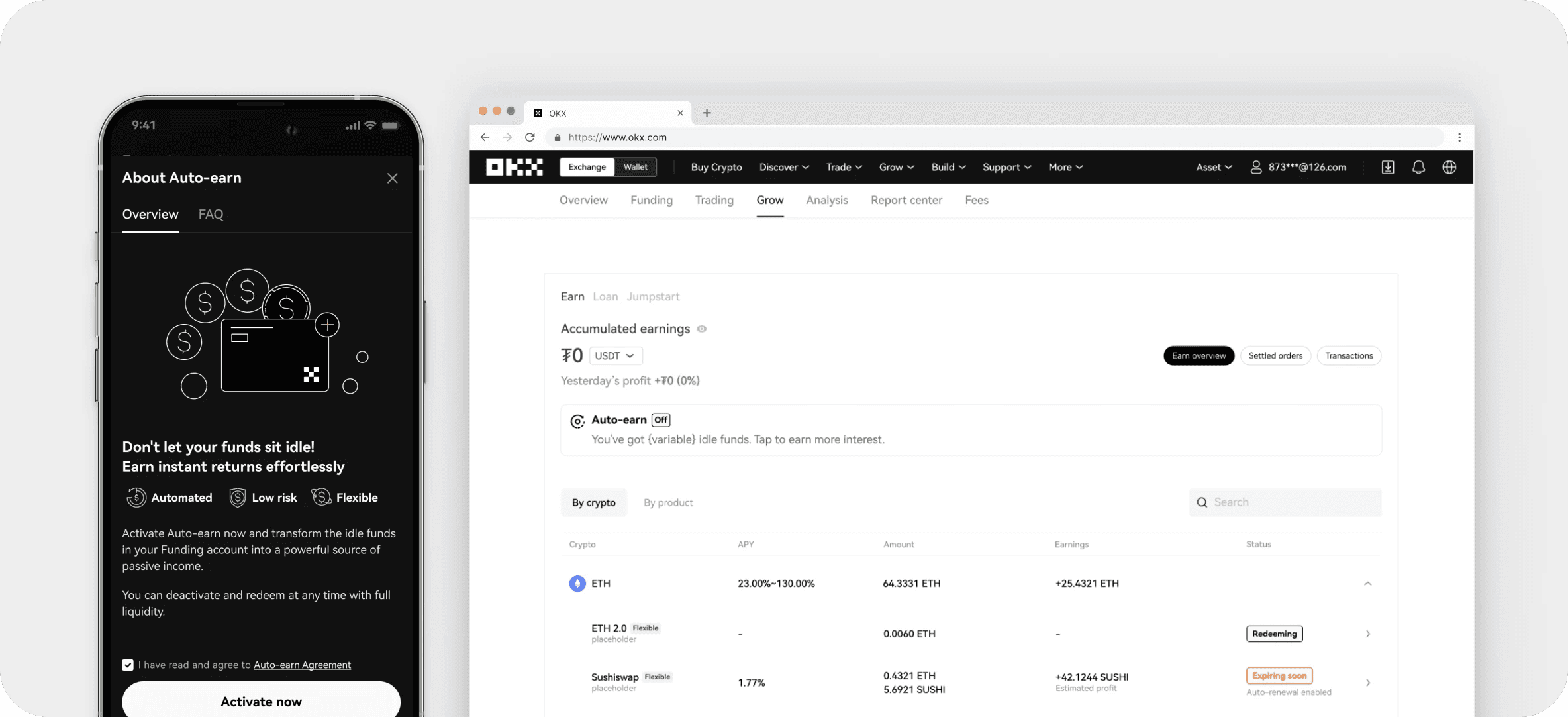
Complemented with dark mode and website integration
Upon delivering high-fidelity User Interface designs and content variations, I also prepared the complementing dark mode and website designs to create a unified Auto-earn experience.