Background
Apron connects travelers and individuals exploring new destinations with a temporary solution for their culinary needs. For individuals far from home, it provides access to kitchens for rent, enabling them to cook meals aligned with their dietary preferences and tastes. On the other side, homeowners can monetize their kitchen spaces by offering them for temporary rentals, creating a seamless and mutually beneficial arrangement.
Core problem
Appron requires an app icon that effectively communicates the app’s functionality while embodying a friendly and approachable look and feel. The design must be distinctive enough to capture user attention in a crowded app market and provide a clear idea of the app’s purpose at a glance. The icon should seamlessly blend aesthetic appeal with functionality to enhance brand recognition and user engagement.
My Process for Apron App Icon
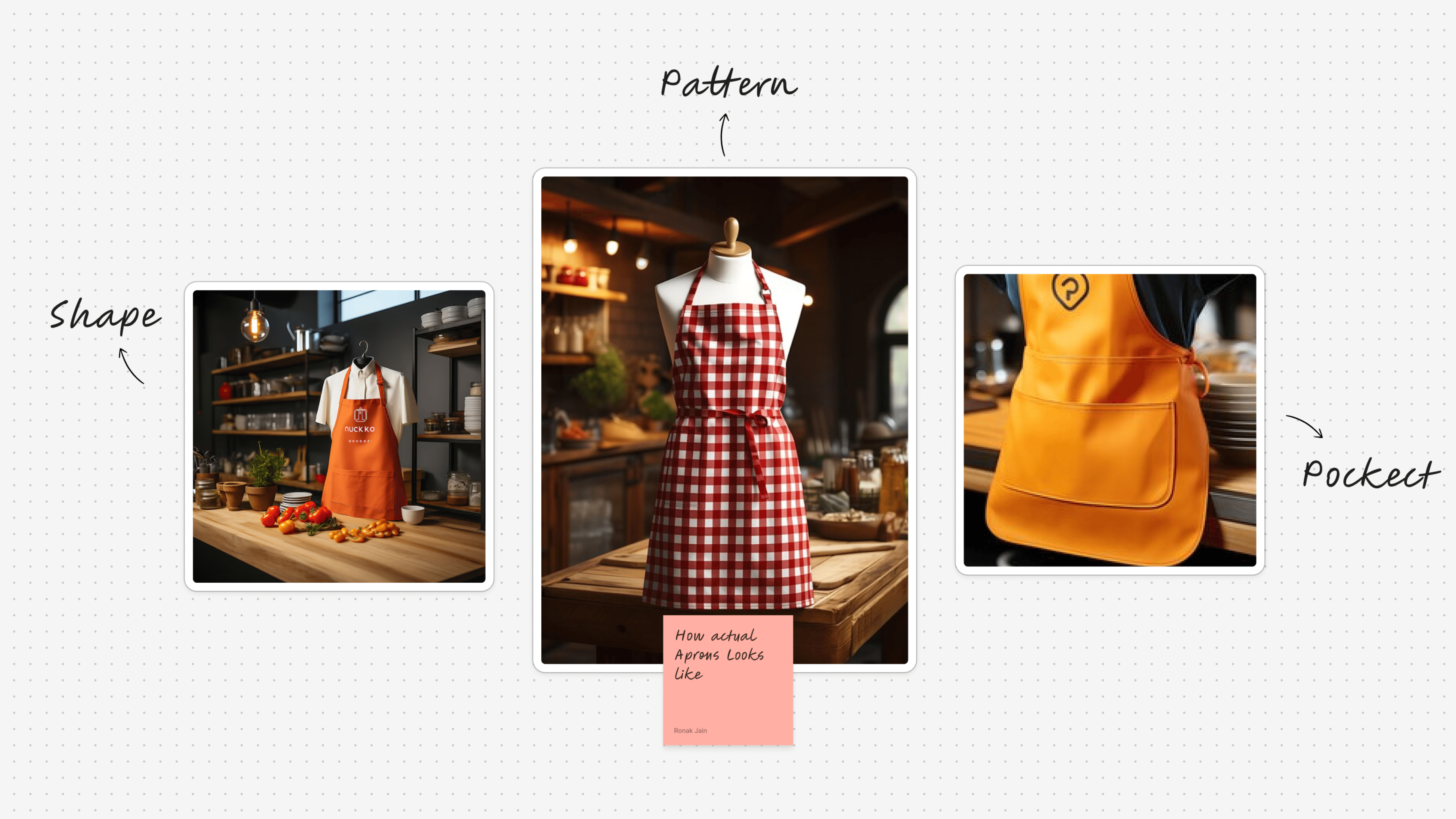
To craft the perfect app icon for the Appron app, I began by drawing inspiration from the core element of a kitchen apron. Initial sketches included realistic apron designs, which I converted into vector illustrations for potential use as the app icon. However, I felt these designs were too detailed and lacked the simplicity needed for a modern app icon.
Striving for minimalism and clarity, I shifted focus to a design that could resonate with users while staying true to the essence of the brand. I explored various iterations, incorporating a checkered pattern reminiscent of classic aprons, which evokes a sense of warmth and familiarity. To ensure brand consistency, I integrated the vibrant orange color from the Appron branding into these designs.
The final approach aimed for a balance between simplicity and distinctiveness—an icon that not only stands out in a crowded app marketplace but also communicates the app’s purpose with a clean and modern aesthetic.
Next Step
I began by iterating through different illustrations and design variations, exploring creative ways to combine these concepts into a cohesive icon.
To achieve this, I vectorized various real-world examples of aprons and related elements, breaking them down into their simplest forms. This step allowed me to focus on the essential shapes and patterns, enabling a clean and modern aesthetic. I experimented with blending key elements—such as the checkered patterns and orange branding of the Appron app—into visually appealing compositions.
Throughout this art direction process, I explored multiple variations, testing how different design choices impacted the icon’s clarity, recognizability, and overall appeal. Each iteration brought me closer to a minimal, yet impactful, design that effectively communicates the app’s functionality while standing out in a competitive market.

Final Design Approach for the Appron App Icon
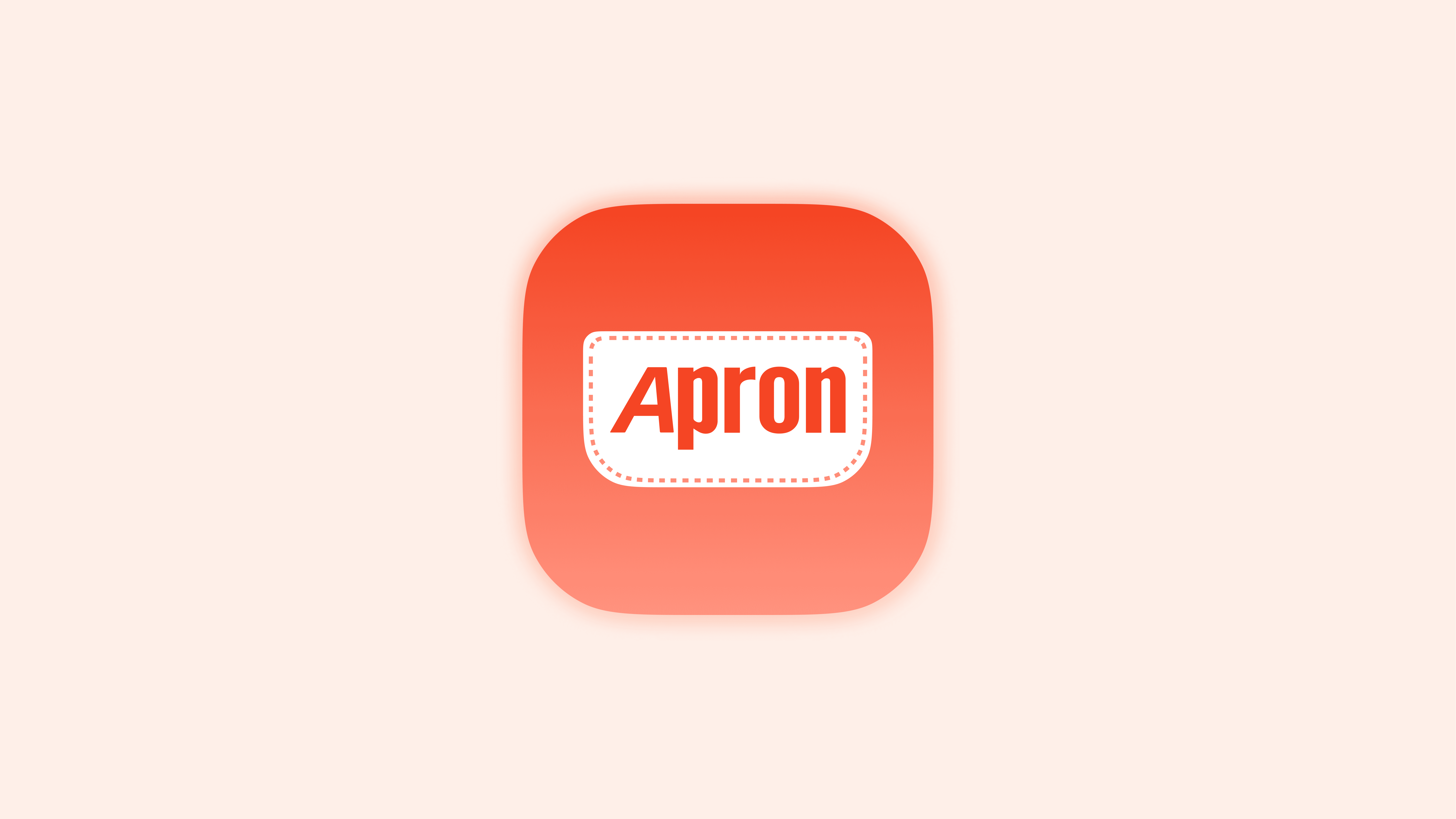
After thoroughly exploring various art directions and sketches, I arrived at a clean and simple design approach that captures the essence of an apron. The focal point of this concept was the pocket—a defining and functional feature of any apron. Recognizing its significance, I used the pocket as the core inspiration for the app icon.
I illustrated the pocket and incorporated it into the design, emphasizing the real-life details that make it relatable and tactile. To bring this concept to life, I added stitch patterns around the pocket. These stitches serve as a crucial element, bridging the gap between the digital design and the real-world feel of an apron. The stitches enhanced the overall aesthetic, making the icon feel more grounded and engaging.
By combining simplicity with thoughtful details, this final design strikes the perfect balance between minimalism and realism, creating a unique, recognizable, and appealing app icon that aligns seamlessly with Appron’s branding and functionality.